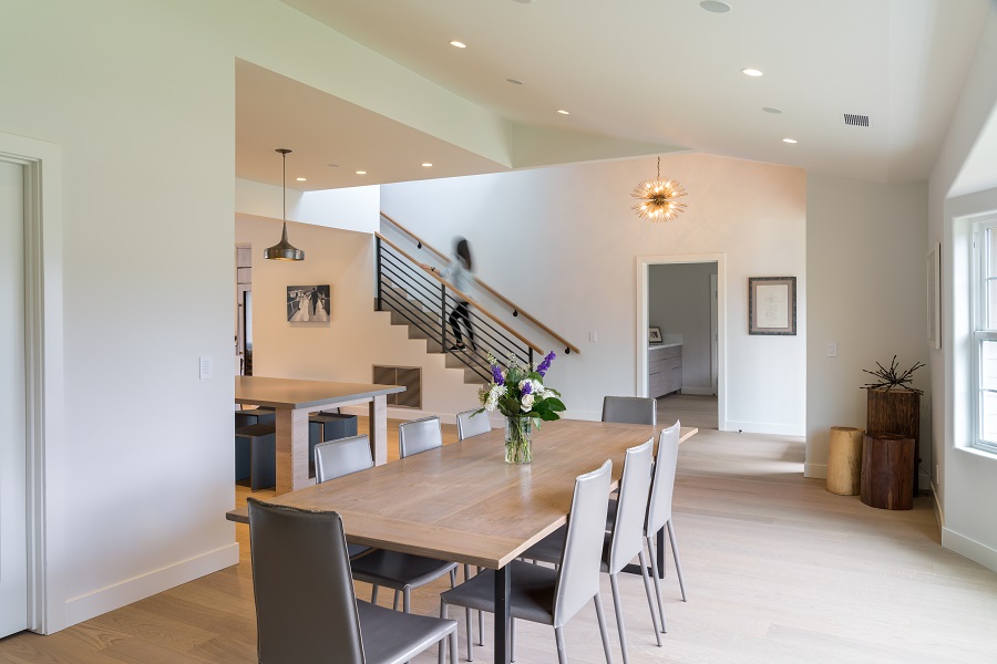
5 Cringe-Worthy Mistakes in Common Home Lighting Plans
Work with Our Lighting Designers to Properly Illuminate Your Home

During a home build, architects create a lighting plan that may look great on paper. The layout seems clean, symmetrical, and functional. Checks all around, right? Not necessarily. Too often, these plans aren’t designed with you in mind, which results in underwhelming and impractical lighting installations.
David Warfel, founding designer of Light Can Help You, presented at the CEDIA Virtual Expo last year on the Nine Deadly Sins of Lighting Layouts that his team sees all the time, and the home lighting designers at Wipliance couldn’t agree more. Below, we highlight five of these lighting mistakes we see most often in Seattle, WA, and surrounding areas. Have you seen these mistakes, too? Read on to find out.
SEE ALSO: What Can a Day Look Like with Whole-Home Lighting Control?
Four Cans and a Fan
Commonly seen in bedrooms and living rooms, fan lights paired with four surrounding can lights may seem like a practical specification at first glance. However, this layout means you’re strictly limited to light coming from above you. As a result, you light the floor and nothing else. This layout doesn’t consider your furniture or how you plan to use the space. While it may be sufficient light for painting the room and installing the carpet, that’s really where its effectiveness ends.
Vanity Insanity
Unfortunately, bathroom lights are usually tied to just one switch, which prohibits you from adjusting individual fixtures to create the light you need for specific tasks or various times of the day. Additionally, we typically see bathroom lights installed right above the mirror. This placement casts undesirable shadows on your face, making you look tired and worn. Instead, soft lights should be placed on either side of the mirror to reflect a healthy glow with no unwanted shadows.
Countertop Caper
A lighting installation can look beautiful in the ceiling, but how useful are those lights when they cast on surfaces? Too often, lights are lined and placed in relation to the ceiling rather than with countertops in mind. As a result, light illuminates only parts of surfaces that may be used for cooking and chopping—two activities that require full and ample light to avoid accidents like burning or cutting your hands.
Death of Details
Unique architectural details like arched entryways, decorative molding, wainscoting, box beams, vaulted ceilings, and more should be celebrated with light. Unfortunately, these gorgeous characteristics are often not illuminated properly, resulting in missed opportunities to showcase these features to guests or enjoy them on your own. Conversely, these features are sometimes bombarded with too much light, creating unwanted hotspots rather than soft elevations of light that complement the surrounding space.
Binary Existence
Traditionally, home light control presents two options: on and off. This binary control method still exists in many homes today, severely limiting the homeowners’ capabilities to create a space that works for them at any given point in time. You either get light in full force or no light at all.
At the very least, light installations should incorporate dimmers so you can scale light intensity to your liking. Tunable light is another dimension that allows you to adjust the color temperature of your white LED lighting from cool blues to warm ambers to add energy, serenity, and ambiance to a space.
Call on the Lighting Experts at Wipliance
Don’t fall into the traps of these common lighting plan mistakes when building your new home. Instead, bring in Wipliance early in the project to design a custom lighting layout that beautifully illuminates your home and caters to your unique needs. We work with leading light source and control manufacturers like Ketra and Lutron to create smart, powerful, adaptable, and personalized lighting systems that transform any space at the touch of a button.
Learn more about our home lighting services by contacting our designers today. Fill out our contact form or send us a message below to schedule a free consultation. We look forward to hearing from you.
